How This Site Was Built (And Why Web Design Just Changed)
The site you're reading this on is new. Set aside the obvious narcissism of a site whose homepage is five video chapters of me walking around — I'll come back to that — because the interesting part isn't the result. It's that the whole thing took three hours, start to finish, and almost none of that was spent on the part that used to be hard.
Here's how it was actually done.
Start with the character, not the code
The homepage is a scroll-driven sequence. You scroll, and the video advances frame by frame: an orbit around me, a walk through a gallery, a push through a studio, two portrait plates. Five separate clips.
The hard problem with that idea isn't the scrolling. It's that it's supposed to be me in all five, and generative video does not naturally give you the same face twice.
That's what Higgsfield's Souls solve.
Creating a Soul
A Soul is a trained identity model. You give it a set of photographs of one person, it trains for about ten minutes, and you get back a soul_id you can use in any later generation. From then on, that's your face.
The process is genuinely this short:
- Collect 5–20 reference images of one person. Variety helps — different angles, different lighting, different distances. This is the only step that materially affects quality, so spend your effort here.
- Upload them. Higgsfield won't take local file paths; images have to be uploaded and confirmed first, or referenced by URL.
- Train. Give it a name and the images. It runs in the background for roughly ten minutes.
- Use the
soul_idin your generation calls.
Two constraints worth knowing before you commit:
- A trained Soul only works with Soul V2 (
soul_2) and Soul Cinema (soul_cinematic). If you want to use your likeness with Nano Banana Pro, Seedream, or the Cinema Studio models, a Soul is the wrong tool. - One Soul per generation. You cannot put two trained Souls in the same shot. "Me and a colleague" is not a Soul job.
For those cases the alternative is a Reference Element — you save a single image as a reusable element instead of training a model. It's instant rather than ten minutes, it supports multiple subjects in one shot, and it works across far more models. The trade is fidelity: a Soul is identity-faithful in a way one reference image isn't.
The rule of thumb I'd give: train a Soul when the same single person needs to appear repeatedly across a body of work. Use Elements for one-offs, for anything that isn't a person, and for any shot with more than one subject.
For five clips that all had to be the same person, a Soul was the only sensible answer.
Claude Code with the Higgsfield MCP
The second piece is that I didn't drive any of this through a web UI.
Higgsfield exposes an MCP server, and Claude Code speaks MCP. That means the agent writing the CSS is the same agent generating the imagery. Ask for a hero image and it picks a model, writes the prompt, submits the job, polls until it's done, downloads the result, resizes and re-encodes it, drops it in static/images/, and references it from the markup.
That sounds like a convenience. It isn't — it's a change in kind.
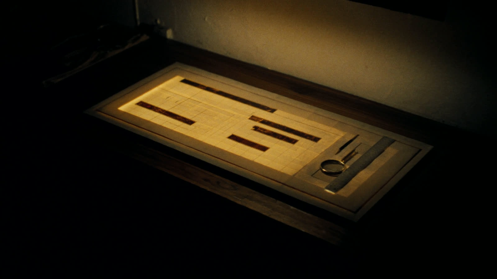
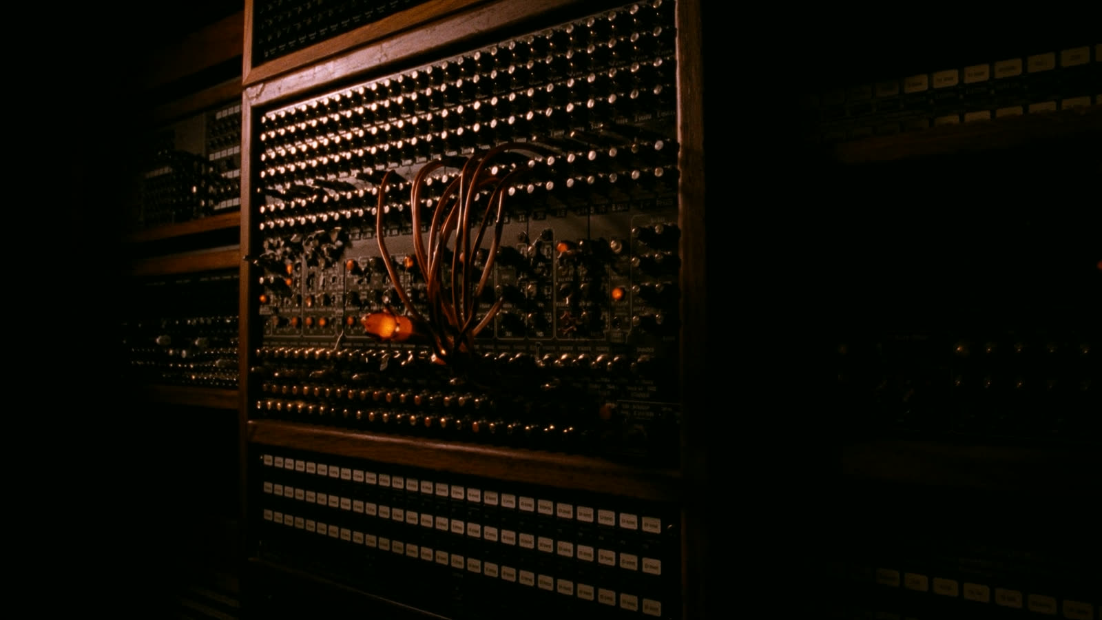
When asset generation lives in a browser tab, images are a separate task with its own context switch, and you end up designing around whatever you happened to make earlier. When it lives in the same loop as the code, the image is just another thing the build needs, generated to fit the space it's going into. The three photographs in this post were made after the words, sized for the slots they sit in.
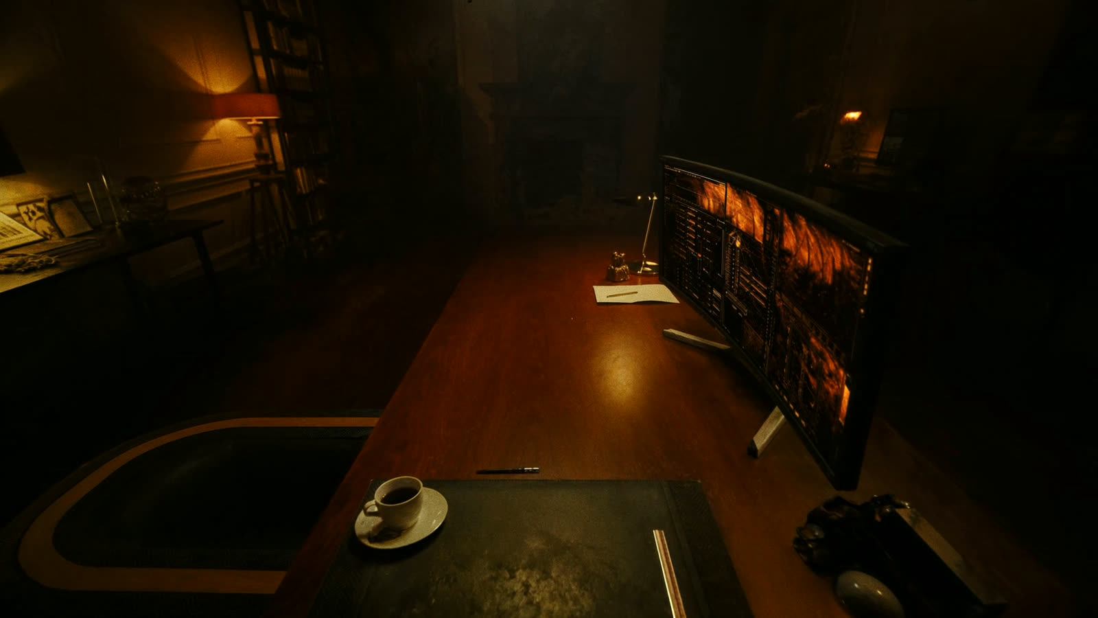
The whole visual language of this site — ink black, deep walnut, tungsten, burnished copper, a tiny red status LED — was described once, and then everything downstream inherited it. Environment plates, page mastheads, the social card. Same room, every time.
Static first, framework second
Here's the decision I'd repeat.
The site is a Gatsby blog with seventeen years of posts behind it. The obvious move is to build the new homepage in React from the start. I didn't. The first version was a plain static site: semantic HTML, modern CSS, a little JavaScript, GSAP for the scroll work. No build step, no components, no framework.
The reason is that the hard part of this design isn't React. It's the choreography — how fast the video scrubs, how the type settles, where the copy sits so it doesn't cover my face, what happens on a phone. All of that is HTML, CSS and a scroll handler. Adding a framework while you're still figuring out the feel means every experiment costs a rebuild and every bug has two possible homes.
So: get it right as a static page. Then port it.
Some of what fell out of that phase was pure plumbing, and worth writing down:
- The source clips were HEVC. Chrome and Firefox won't decode HEVC in MP4. On most machines the page would have been a black rectangle. Everything got re-encoded to H.264.
- Scrubbing needs dense keyframes. Seeking to an arbitrary time in a normally-encoded video means decoding from the last keyframe, which can be seconds back. Encoding with a keyframe every six frames (
-g 6 -keyint_min 6 -sc_threshold 0) makes seeks land immediately. That single flag is the difference between a scrub that feels like a shuttle and one that feels like a slideshow. - Never set
currentTimefrom a scroll handler. The scroll listener writes a target number and nothing else. A singlerequestAnimationFrameloop eases the actual video time toward that target. Seeking stays off the scroll thread, and you get the smooth trailing motion for free. - CSS
position: stickybeat GSAP's pinning. Transform-based pinning fights mobile browser chrome and dynamic viewport units. Sticky doesn't. GSAP still drives every progress-based animation; it just doesn't do the pinning.
Then integrate
Porting the static page into Gatsby was the least interesting part, which is exactly the point — by then every real decision was made.
The chapters became React components. The scroll engine stayed almost byte-for-byte identical; it mounts onto the rendered DOM in a single effect and returns a teardown, because Gatsby keeps the app alive across client-side navigation and anything left behind leaks on every route change. React renders the markup; nothing re-renders during scroll.
The bigger job was making the rest of the site belong to the new design. One set of tokens now feeds the homepage, the writing archive, the résumé and every post. Syntax highlighting was retuned to the same warm palette, because on a blog like this, code is most of what you see.
Integration also surfaced a pile of things the standalone build had hidden:
- The tag filter listed
Javaandjavaas separate tags, which had been true for years and invisible until the design uppercased everything. - The archive scrolled sideways on a phone, because a bare
1frgrid track floors atmin-contentand one long post title was enough to push the page over. - Mobile had no navigation at all on the blog and résumé pages.
None of these were interesting. All of them would have shipped.
The part web designers won't enjoy
Now the uncomfortable bit.
I am not a designer. I could not have produced this by hand — not the type pairing, not the palette, not the video, and certainly not the choreography. A few years ago this site would have been a five-figure engagement and a six-week timeline, and I'd have spent most of it in review meetings looking at things I didn't ask for.
It took three hours. The expensive part was my taste, not my hands.
Read that number again, because it's the whole argument. Not a weekend. Not a sprint. An afternoon — including the false starts, the re-encodes, and the bugs.
I don't think that means design is over. Watch what actually happened in this project: every genuinely good decision was a judgement call. Cropping a burned-in caption out of a clip because it read as a fabricated credential. Killing the emoji icons on the résumé because they fought the palette. Deciding the diagram needed its own panel because it was sitting across my face. Knowing that a wide right margin is composition and not a mistake. No model volunteered any of that.
What is over is the part of the job that was execution. Turning a direction into HTML, producing the hero image, cutting the mobile breakpoints, wiring the animation — that work has collapsed to near zero. If your value was in doing that competently, the floor just came up to meet you, and it's going to keep coming.
The people who'll do fine are the ones who can look at a generated page and say precisely why the hierarchy is wrong. That skill got more valuable this year, not less. But it's now the whole job rather than the reward at the end of a long production process, and that's a genuinely different profession from the one a lot of people signed up for.
The bar moved. It isn't moving back. Get on board.
Try it yourself
If you want to reproduce the workflow rather than the site:
- Higgsfield for generation. Train a Soul if you need one person to recur; use Reference Elements for anything else.
- Claude Code with the Higgsfield MCP so generation and code live in one loop.
- Build static first. Get the feel right with no framework in the way, then port it.
- Re-encode your video properly. H.264, dense keyframes, a smaller mobile variant, and a poster frame for when it fails.
- Respect
prefers-reduced-motion. This site ships in a reduced, fully readable state and only upgrades when motion is allowed — which also means it degrades correctly with no JavaScript at all.
The code is on GitHub. The narcissism is on the homepage.